|
General
An Image Radio Button control is a GUI control that works in a group with others where only one may be selected ON at any time; selecting another in the group will turn them all OFF except the selected one. Unlike the standard Radio Button, images are assigned to it. Reading the value of the Image Radio Button, [controlName], returns a 0 or 1 for OFF and ON respectively for its state property (also the default property). One in a group may be set in code using !controlName=1. Additionally, it may be assigned a hotKey, such that using ALT-key will activate the control, and if the key is in the name, it will be underscored, such as using a hotKey of H in control with text of 'High' or 'M' in a control with the text of 'Medium' and 'L' in a control with the text of 'Low'.
Unlike the standard Button, the Image Button is assigned images for the 'normal view' (icon property), the 'mouse-over' or 'hover' image (iconHover property) and the 'pressed' image (iconOn property). These may come from the media directory of MakerPlotJ or any image file on the computer. If you wish to make your interface package portable, please see Portable Interface Packages.

The above shows that speed is selected to Medium and the others are off. Clicking 'High' will turn it 'ON' and the others 'OFF'. Note that their hotKey letters are underscored.
The style of the control allows the text to be below the image (textBelowIcon property) or trailing the image (textTrailsIcon property). Note that the icon height and width percentage properties as well as the font color may need to be adjusted, or simply select a pre-made one from the palette.

There may be 10 different groups of Image Radio Buttons per interface numbered by setting the control’s group property from 0 to 9, to define which group it belongs to.
Image Radio Button Creation
Image Radio Button controls may be placed on the main or children interfaces using the Controls Palette, use F2 to open. When placing it, it will ask for the name of the control, irad is the recommended prefix for the name, such as iradHigh. It will also ask for the text you want the control to have. Once done, click a location or draw to desired size. Like most controls, the font size will be based on the height of the control.
An Image Radio Button may also be created using code, such as from the file save, the Debug/CLI window, the microcontroller sending the string or other controls.
!makeImgRadioButton Name, Left, Right (,Width, Height, Text, HotKey) Parameters in () may be omitted.
If it is to be on a child interface:
!interfaceName.makeImgRadioButton Name, Left, Right (,Width, Height, Text, HotKey) Parameters in () may be omitted.
Example:
!makeImgRadioButton tglbPower, 20,20,25,5,High,H
Once placed, it may be repositioned and resized by unlocking the interface’s controls, F9, and dragging/sizing it. It may be copied or deleted by placing your mouse pointer over it and using CTRL-C and CTRL-X, and pasted using CTRL-V.
Instructions:
Instructions are used to inform the control to perform some operation. The Image Radio Button control has no special instructions beyond the basic ones of all controls. See Instructions for more information on instructions.
 Properties Properties
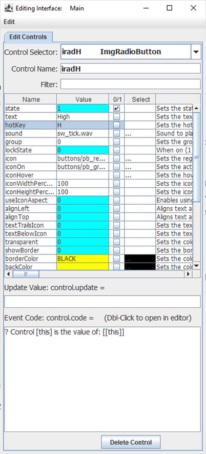
Properties are the look, ‘feel’, and other characteristics of a control or object. They may be viewed or set using the Debug/CLI or the Interface Editor. Placing the mouse pointer over a control and pressing F3 will open the Interface Editor. Here you may view all accessible properties of the Image Radio Button control and modify them as desired. Please see the Interface Editor page for more information on the editor.
Properties may be set in code using:
!controlName.property=someValue
The default property, value, may be set with:
!controlName=someValue
They may be read in code using:
[controlName.property]
The default property, state, may be read with:
[controlName]
When used in its Event Code, [this] may be used in place of the controlName for reads and writes.
As discussed at the top, the images for normal, hover and on may be changed as well as setting text below or trailing the icon.
Update Value
The update value will cause the control to update to a specified value each time analog, digital or message string are processed.
For example, using [din0] will cause the control’s state to be updated to the left-most (MSB) digital value when a string such as %001 is processed.
Note that an Image Radio Button can only be turned ON (1), not OFF (0).
Other properties, such as its backColor can be updated by specifying it as the property:
.backColor=[ain0] // value from 0 to 16.7 million
Math may be used in the Update Value, such as { ![din0] } for inverting the value (0 becomes 1 and 1 becomes 0).
Event Code
For an Image Radio Button, the Event Code will run when the Image Radio Button is clicked. Please see Event Code for a full discussion on event code. In many cases it may have no code and simply be read by another element’s code or simply be used to set the state of some control’s Boolean property.
!plot.plotOn=[[this]]
The use of !this.someCommand or !this.someProperty in the event code refers to the control that is running it, as does [this.someProperty] or [this] for the control’s name and [[this]] for the control’s default value. This allows controls to have the same generic code for unique purposes and reduce coding issues, such as if the name is changed.
Double-Clicking the text area will open the Code Editor where, like the Debug/CLI, it can provide contextual help and suggestions. Please see the Code Editor page for more information.
The code for the control can be executed from other code in the interface using:
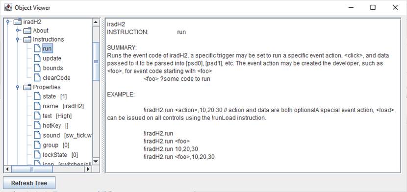
!controlName.run
Activating the Image Radio Button with a click or hotKey will trigger its normal event code when clicked.
The control also supports <load> event trigger, which will run its code when the !runLoad instruction is issued which goes to all control or !control.run <load> is used which will trigger the specific control. This could be used to ensure the control is off or on when loaded or to reset it back to a default value:
<load>![this]=0
The Image Radio Button also supports event triggers of <on> and <off> representing the new state of the control.
Please see advanced topics on using event triggers and passing data to events.
<on> ? [this] is on
<off> ? [this] is off
Supported Event Triggers:
A RadioButton click or hotKey, no trigger identifier used.
<load> Issued when an interface is finished loading or manually with !runLoad.
<on> Issued when the user selects the control.
<off> Issued when the user de-selects the control.
More Information:
There exist multiple means of getting information about specific control values, properties, instructions, and events. The Control Editor shown above has abbreviated descriptions in the right-hand column. Expand the window and column to see more at once.
The Controls Viewer allows users to see detailed on controls. Open using F6 and expand out to find the information of interest including examples of use.

The Debug/CLI and Code Editor also provide contextual help. Please see those pages on using them for help.
|