|
General
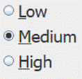
A RadioButton control is a standard GUI control that may be selected to be checked ON or OFF by clicking on it, but they work as part of a group. Only one in any interface group can be ON at any one time. Clicking one ON will turn the others in the group off. The group is set using the group property, 0-9, per interface. Reading the value of the RadioButton, [controlName], returns a 1 or 0 for selected and unselected respectively. It may be set in code using !controlName=1 and will affect others in the group if ON. The only way to turn one off is by turning another in the group ON. Additionally, it may be assigned a hotKey, such that using ALT-key will activate the control, and if the key is in the name, it will be underscored, such as using a hotKey of 'L' in control with text of Low (Note L, M and H underscored).

Control Creation
RadioButton controls may be placed on the main or children interfaces using the Controls Palette, use F2 to open from the desired interface. When placing, it will ask for the name of the control, rbtn is the recommended prefix for the name, such as rbtnReset. It will also ask for the text for the control to have. Once done, click a location or draw to desired size. Like most controls, the font size will be based on the height of the control.
A control may also be created using code, such as from a saved file, the Debug/CLI window, the microcontroller sending the string, or other controls.
!makeRadioButton Name, Left, Right (,Width, Height, Text, HotKey) Parameters in () may be omitted.
If it is to be on a child interface:
!interfaceName.makeRadioButton Name, Left, Right (,Width, Height, Text, HotKey) Parameters in () may be omitted.
Example:
!makeRadioButton rbtnSpeed, 20,20,25,5,High,H
Once placed, it may be repositioned and resized by unlocking the interface’s controls, F9, and dragging/sizing it. It may be copied or deleted by placing your mouse pointer over it and using CTRL-C and CTRL-X, and pasted using CTRL-V.
Instructions:
Instructions are used to inform the control to perform some operation. The control has no special instructions beyond the basic ones of all controls. See Instructions for more information on instructions.
Properties
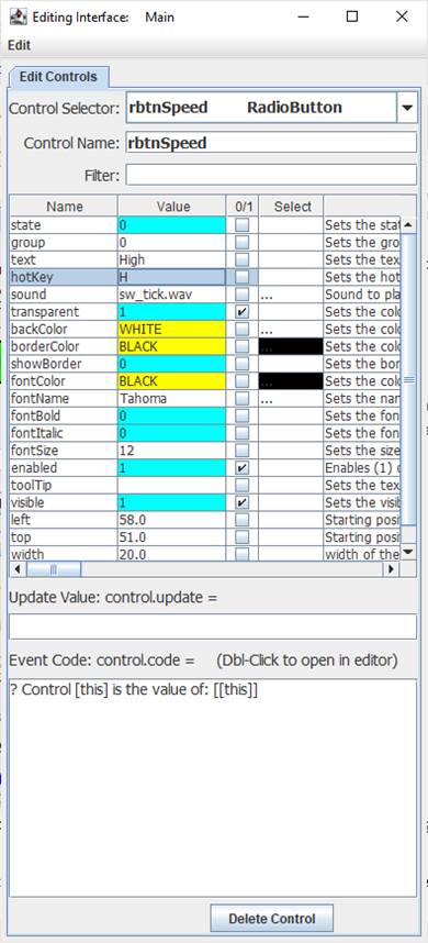
 Properties are the look, ‘feel’, and other characteristics of a control or object. They may be viewed or set using the Debug/CLI or the Interface Editor. Placing the mouse pointer over a control and pressing F3 will open the Interface Editor. Here you may view all accessible properties of the RadioButton control and modify them as desired. Please see the Interface Editor page for more information on the editor. Properties are the look, ‘feel’, and other characteristics of a control or object. They may be viewed or set using the Debug/CLI or the Interface Editor. Placing the mouse pointer over a control and pressing F3 will open the Interface Editor. Here you may view all accessible properties of the RadioButton control and modify them as desired. Please see the Interface Editor page for more information on the editor.
Properties may be set in code using:
!controlName.property=someValue
The default property, state, may be set with:
!controlName=someValue
They may be read in code using:
[controlName.property]
The default property, state, may be read with:
[controlName]
When used in its Event Code, [this] may be used in place of the controlName for reads and writes.
The group property defines to which interface group the radioButton belongs.
Update Value
The update value will cause the control to update to a specified value each time analog, digital, or message string are processed.
For example, using [din0] will cause the control’s state to be updated to the left-most (MSB) digital value when a string such as %001 is processed. The bit value, where bit0 is the leftmost or LSB value, may be used as well [bit0].
Other properties, such as its backColor can be updated by specifying it as the property:
.backColor=[ain0] //ensure transparent is off to test with a value from 0 to 2 billion
Event Code
For a RadioButton, the Event Code will run when the control is clicked or using its hotkey. Please see Event Code for a full discussion on event code. In many cases it may have no code and simply be read by another control’s code or simply be used to set the state of some control’s Boolean property.
!plot.plotOn=[[this]]
The use of ![this].someCommand or ![this].someProperty in the event code refers to the control that is running it, as does [[this].someProperty] or [this] for the control’s name, and [[this]] for the control’s default value. This allows controls to have the same generic code for unique purposes and reduce coding issues, such as if the name is changed.
Double-Clicking the text area will open the Code Editor where, like the Debug/CLI, it can provide contextual help and suggestions. Please see the Code Editor page for more information.
The code for a RadioButton control can be executed from other code in the interface using:
!controlName.run or !controlName.
The control also supports <load> event trigger, which will run its code when the !runLoad instruction is issued which goes to all control or !control.run <load> is used which will trigger the specific control. This could be used to ensure the control is off or on when loaded or to reset it back to a default value:
<load>[this]=1
The CheckBox also supports event triggers of <on> and <off> representing the new state of the control.
Please see advanced topics on using event triggers and passing data to events.
<on> ? [this] is on
<off> ? [this] is off
Supported Event Triggers:
A RadioButton click or hotKey, no trigger identifier used.
<load> Issued when an interface is finished loading or manually with !runLoad.
More Information:
There exist multiple means of getting information about specific control values, properties, instructions, and events. The Control Editor shown above has abbreviated descriptions in the right-hand column. Expand the window and column to see more at once.
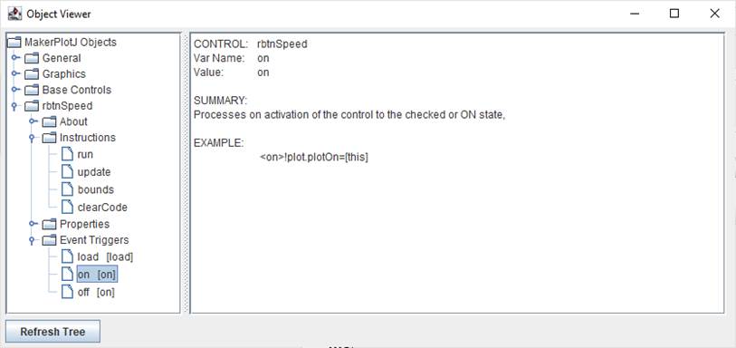
The Controls Viewer allows users to see detailed on controls. Open using F6 and expand out to find the information of interest including examples of use.

The Debug/CLI and Code Editor also provide contextual help. Please see those pages on using them for help.
|