|
General
The ProgressBar control allows viewing the status of a value between the positive minimum (min) and maximum (max). Its default value may be retrieved with [controlName] or [[this]] in its own code.
 
Vertical and horizontal ProgressBars are supported and will switch based on their height vs width.
Control Creation
Controls may be placed on the main or children interfaces using the Controls Palette, use F2 to open from the desired interface. When placing, it will ask for the name of the control, pbar is the recommended prefix for the name, such as pbarFlowRate. It will also ask for the text for the control to have. Once done, click a location or draw to desired size. Like most controls, the font size will be based on the height of the control.
A control may also be created using code, such as from the file save, the Debug/CLI window, the microcontroller sending the string or other controls.
!makeProgressBar Name, Left, Right (,Width, Height, Min, Max, Value) Parameters in () may be omitted.
If it is to be on a child interface:
!interfaceName.makeProgressBar Name, Left, Right (,Width, Height, Text, Min, Max, Value) Parameters in () may be omitted.
Example:
!makeProgressBar pbarFlowRate, 20,20,30,10,0,50,25
Once placed, it may be repositioned and resized by unlocking the interface’s controls, F9, and dragging/sizing it. It may be copied or deleted by placing your mouse pointer over it and using CTRL-C and CTRL-X, and pasted using CTRL-V.
While it only supports integers, the value may be divided in code, for values in tenths for example:
? { [sldPressure] / 10 }
Instructions:
Instructions are used to inform the control to perform some operation. The ProgressBar has only those common to all controls.
See Instructions for more information on instructions.
 Properties Properties
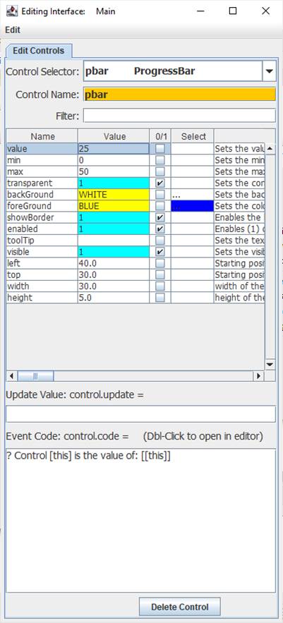
Properties are the look, ‘feel’, and other characteristics of a control or object. They may be viewed or set using the Debug/CLI or the Interface Editor. Placing the mouse pointer over a control and pressing F3 will open the Interface Editor. Here you may view all accessible properties of the control and modify them as desired. Please see the Interface Editor page for more information on the editor.
Properties may be set in code using:
!controlName.property=someValue
The default property, value, may be set with:
!controlName=someValue
They may be read in code using:
[controlName.property]
The default property, value, may be read with:
[controlName]
When used in its Event Code, [this] may be used in place of the controlName for reads and writes.
Ensure transparent is off when using the backColor.
The min and max properties are used to set the indicating range of the control.
Update Value
An Update Value is used to update a property of the control when new analog, digital or message data arrives and could be used to change the value.
[ain0]
{ [ain0] / 10 }
Event Code
When changed by either using the arrows or by entering a new value, the event code will trigger. Please see Event Code for a full discussion on event code.
The use of !this.someCommand or !this.someProperty in the event code refers to the control that is running it, as does [this.someProperty] or [this] for the control’s name and [[this]] for the control’s default value. This allows controls to have the same generic code for unique purposes and reduce coding issues such as if the name is changes.
Double-Clicking the Event Code text area will open the Code Editor where, like the Debug/CLI, it can provide contextual help and suggestions. Please see the Code Editor page for more information.
The code for a button control can be executed from other code in the interface using:
!controlName.run or !controlName.
The control will trigger its normal event code when clicked. The only named trigger event the control current supports is <load>, which will run its code when the !runLoad instruction is issued, which applies to all control, or when !control.run <load> is used, which will trigger the specific control. <load> can be used to set a certain value in the control when the interface is loaded or !runLoad issued.
Please see advanced topics on using event triggers and passing data to events.
Supported Event Triggers:
Clicking the control
<load> Triggered when the !runLoad command is issued, such as when loading an interface.
More Information:
There exist multiple means of getting information about specific control values, properties, instructions, and events. The Control Editor shown above has abbreviated descriptions in the right-hand column. Expand the window and column to see more at once.
The Controls Viewer allows users to see detailed on controls. Open using F6 and expand out to find the information of interest including examples of use.

The Debug/CLI and Code Editor also provide contextual help. Please see those pages on using them for help.
|