|
General
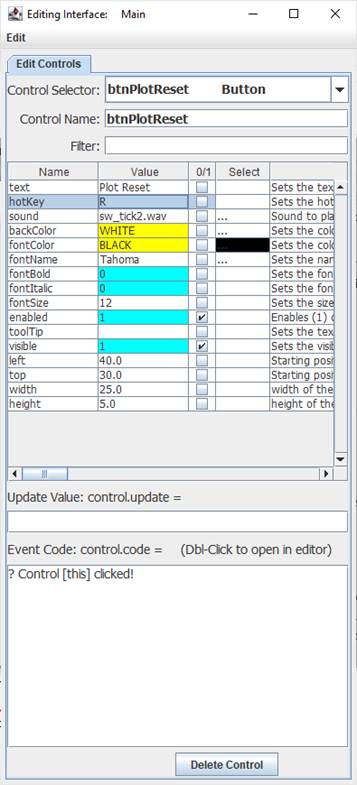
The Button control is a clickable control like standard GUI buttons. Clicking it will cause the Event Code to run, so for a button the trigger event is a ‘click’. A Button may be assigned a hotKey, such a R for a button with text of Plot Reset- Note that the R will be underlined. This allows the ALT-R key combination to activate the button as well as clicking on it. If the hotKey value is part of the text, it will be underlined like the R below.

Note: If you change the backColor to something else, you will NOT be able to change it back to the default color scheme.
Control Creation
Button controls may be placed on the main or children interfaces using the Controls Palette, use F2 to open. When placing, it will ask for the name of the control, btn is the recommended prefix for the control name, such as btnReset. It will also ask for the text for the control to have. Once done, click a location or draw to desired size. Like most controls, the font size will be based on the height of the control.
A button may also be created using code, such as from the file save, the Debug/CLI window, the microcontroller sending the string or other controls.
!makeButton Name, Left, Right (,Width, Height, Text, HotKey) Parameters in () may be omitted.
If it is to be on a child interface:
!interfaceName.makeButton Name, Left, Right (,Width, Height, Text, HotKey) Parameters in () may be omitted.
Example:
!makeButton btnReset, 20,20,25,5,Reset Plot,P
Once placed, it may be repositioned and resized by unlocking the interface’s controls, F9, and dragging/sizing it. It may be copied or deleted by placing your mouse pointer over it and using CTRL-C and CTRL-X, and pasted using CTRL-V.
Instructions:
Instructions are used to inform the control to perform some operation. The Button control has no special instructions beyond the basic ones of all controls. See Instructions for more information on instructions.
 Properties Properties
Properties are the look, ‘feel’ and other characteristics of a control or object. They may be viewed or set using the Debug/CLI or the Interface Editor. Placing the mouse pointer over a control and pressing F3 will open the Interface Editor. Here you may view all accessible properties of the button control and modify them as desired. Please see the Interface Editor page for more information on the editor.
Properties may be set in code using:
!controlName.property=someValue
The default property, text, may be set with:
!controlName=someValue
They may be read in code using:
[controlName.property]
The default property, text, may be read with:
[controlName]
When used in its Event Code, [this] may be used in place of the controlName for reads and writes or [this.property]=value for writes.
Update Value
An Update Value is used to update a property of the control when new analog, digital or message data arrives. While the Button control does not have a strong need of an update value, it is still possible to use it. For example, placing [str0] in the update value box will update the text to read the first comma-separated value of an incoming message string such as:
Power, Voltage, Current
It will update with each subsequent string received.
Event Code
For a button, the Event Code is of great importance, as this is the code or instructions that will run when the button is clicked. Please see Event Code for a full discussion on event code.
The use of !this.someCommand or !this.someProperty in the event code refers to the control that is running it, as does [this.someProperty] for reading or [this] for the control’s name and [[this]] for the control’s default value. This allows controls to have the same generic code for unique purposes and reduce coding issues, such as if the name is changed.
Double-Clicking the text area will open the Code Editor where, like the Debug/CLI, it can provide contextual help and suggestions. Please see the Code Editor page for more information.
The code for a button control can be executed from other code in the interface or from the microcontroller using:
!controlName.run or !controlName.
The button will trigger its normal event code when clicked. The only named trigger event the control current supports is <load>, which will run its code when the !runLoad instruction is issued, such on loading an interface, which goes to all control or !control.run <load> is used which will trigger the specific control.
Please see advanced topics on using event triggers and passing data to events.
Supported Event Triggers:
A button click, no trigger identifier used.
<load> Runs code when !runLoad is issued, such as opening an interface file.
More Information:
There exist multiple means of getting information about specific control values, properties, instructions, and events. The Control Editor shown above has abbreviated descriptions in the right-hand column. Expand the window and column to see more at once.
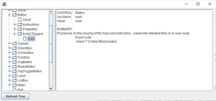
The Controls Viewer allows users to see detailed on controls. Open using F6 and expand out to find the information of interest including examples of use.

The Debug/CLI and Code Editor also provide contextual help. Please see those pages on using them for help.
|