|
General
The Label control is a standard GUI caption control. It can be used to display information on the interface, such as data values or as identifiers for other controls. Its value may be set with !controlName = value and retrieved with [controlName] or [[this]] in its own code for setting some aspect of the interface.

Text using , { } and ; should be avoided as they are special processing characters.
Control Creation
Controls may be placed on the main or children interfaces using the Controls Palette, using F2 to open from the desired interface. When placing, it will ask for the name of the control, lbl is the recommended prefix for the name, such as lblTemperature. It will also ask for the text for the control to have. Once done, click a location or draw to desired size. Like most controls, the font size will be based on the height of the control.
A control may also be created using code, such as from the saved file, the Debug/CLI window, the microcontroller sending the string, or other controls.
!makeLabel Name, Left, Right (,Width, Height) Parameters in () may be omitted.
If it is to be on a child interface:
!interfaceName.makeLabel Name, Left, Right (,Width, Height) Parameters in () may be omitted.
Example:
!makeLabel lblTemperature, 20,20,10,5
!lblTemperature=100
Once placed, it may be repositioned and resized by unlocking the interface’s controls, F9, and dragging/sizing it. It may be copied or deleted by placing your mouse pointer over it and using CTRL-C and CTRL-X, and pasted using CTRL-V.
Instructions:
Instructions are used to inform the control to perform some operation. The Label has one special instruction beyond the standard ones, clear, which will clear the text.
!lblTest.clear
See Instructions for more information on instructions.
 Properties Properties
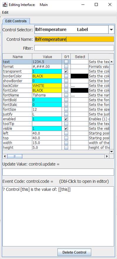
Properties are the look, ‘feel’, and other characteristics of a control or object. They may be viewed or set using the Debug/CLI or the Interface Editor. Placing the mouse pointer over a control and pressing F3 will open the Interface Editor. Here you may view all accessible properties of the button control and modify them as desired. Please see the Interface Editor page for more information on the editor.
Properties may be set in code using:
!controlName.property=someValue
The default property, text, may be set with:
!controlName=someValue
They may be read in code using:
[controlName.property]
The default property, text, may be read with:
[controlName]
When used in its Event Code, [this] may be used in place of the controlName for reads and writes.
Ensure transparent is checked when using the backColor.
The Label has a justify property to justify left (L), right (R) or center (C).
It also has a format property to format numeric data. With a value of 1234.5:
format value of #,###.00 would show 1,234.50
Update Value
An Update Value is used to update a property of the control when new analog, digital, or message data arrives. The Update Value can be very important with this control to display information. For example, placing [ain0] in the update value box will update the text to read the first comma-separated value of an incoming analog string such as:
100,200,300
The label will update with each subsequent string received.
Math and text may be applied to Update Values, such as:
Avg. Temp = { ( [ain0] + [ain1] ) / 2 }F
Note: Formatting will NOT work in this instance since it starts with a non-numeric character, which is required to add text to the value. The Post-Fix format operation may be used instead to format the numeric value (See Post-Fix Math):
Avg. Temp = {:: { ( [ain0] + [ain1] ) / 2 } %.2f format}F
Event Code
The event code is triggered off a mouse click. Please see Event Code for a full discussion on event code.
The use of !this.someCommand or !this.someProperty in the event code refers to the control that is running it, as does [this.someProperty] or [this] for the control’s name and [[this]] for the control’s default value. This allows controls to have the same generic code for unique purposes and reduce coding issues, such as if the name is changed.
Double-Clicking the Event Code text area will open the Code Editor where, like the Debug/CLI, it can provide contextual help and suggestions. Please see the Code Editor page for more information.
The code for a button control can be executed from other code in the interface using:
!controlName.run or !controlName.
The control will trigger its normal event code when clicked. The only named trigger event the control current supports is <load>, which will run its code when the !runLoad instruction is issued, which goes to all control, or !control.run <load> is used which will trigger the specific control. Load can be used to set a certain value in the control when the interface is loaded or !runLoad issued.
Please see advanced topics on using event triggers and passing data to events.
Supported Event Triggers:
Clicking the control.
<load> Triggered when !runLoad is issued, such as when an interface is loaded.
More Information:
There exist multiple means of getting information about specific control values, properties, instructions, and events. The Control Editor shown above has abbreviated descriptions in the right-hand column. Expand the window and column to see more at once.
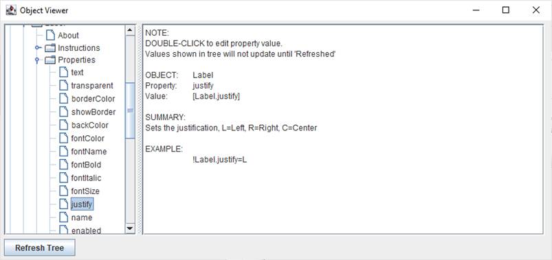
The Controls Viewer allows users to see detailed on controls. Open using F6 and expand out to find the information of interest including examples of use.

The Debug/CLI and Code Editor also provide contextual help. Please see those pages on using them for help.
|