|
General
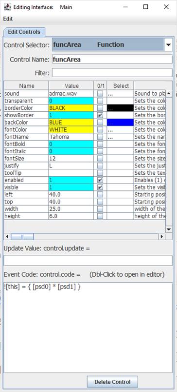
The Function Control is a dedicated control to perform processing of data. Once processed, the results appear in the control’s text and can be accessed by its value with [controlName]. For example, funcArea has the code of:
![this] = { [arg0] * [arg1] } // Calculate area
Calling the function with !funcArea 10,5 or !funcArea.run 10,5 will pass the values of 10 and 5 to the event code where they are accessed by their passed names of [arg0] and [arg1]. The operation will be performed, the value of funcArea will be updated and displayed along with the function’s name:

Once accomplished, the calling routine may access the resultant value with [funcArea]. Note that is not automatically returned as these operations are performed asynchronously.
As discussed below, as with all controls, event triggers may be specified, such as the <load> trigger which runs when an interface is loaded or when !runLoad is issued. While this control has no other built-in triggers, the user may add their own event code triggers, such as:
<rect>![this]={ [arg0] * [arg1] } // calculate area of a rectangle
<triangle>![this] = { 0.5 * [paran0] * [arg1] } // calculate area of a triangle
This function and the unique trigger events can be called with:
!funcArea <rect>,10,20
and
!funcArea <triangle>,10,20
A function control does not need to preform calculations, it could be actions the developer wishes to have performed, such as setting other controls to some desired state, or any actions that may be too cumbersome to put in another control’s code or repetitive code, such as checkbox being clicked ON.
<ON> !funcSetup1
Control Creation
Controls may be placed on the main or children interfaces using the Controls Palette, use F2 to open from the desired interface. When placing, it will ask for the name of the control, func is the recommended prefix for the name, such as funcArea. Once done, click a location, or draw to desired size. Like most controls, the font size will be based on the height of the control.
A control may also be created using code, such as from the file save, the Debug/CLI window, the microcontroller sending the string, or other controls.
!makeFunction Name, Left, Right (,Width, Height) Parameters in () may be omitted.
If it is to be on a child interface:
!interfaceName.makeFunction Name, Left, Right (,Width, Height) Parameters in () may be omitted.
Example:
!makeFunction tmrStop, 20,20,20,5
Once placed, it may be repositioned and resized by unlocking the interface’s controls, F9, and dragging/sizing it. It may be copied or deleted by placing your mouse pointer over it and using CTRL-C and CTRL-X, and pasted using CTRL-V.
Instructions:
 Instructions are used to inform the control to perform some operation. Instructions are used to inform the control to perform some operation.
The Function Control has only the standard instructions.
See Instructions for more information on instructions.
Properties
Properties are the look, ‘feel’, and other characteristics of a control or object. They may be viewed or set using the Debug/CLI or the Interface Editor. Placing the mouse pointer over a control and pressing F3 will open the Interface Editor. Here you may view all accessible properties of the button control and modify them as desired. Please see the Interface Editor page for more information on the editor.
The Label is the only control that has a justify property to justify left (L), right (R) or center (C).
Properties may be set in code using:
!controlName.property=someValue
The default property, text, may be set with:
!controlName=someValue
They may be read in code using:
[controlName.property]
The default property, text, may be read with:
[controlName]
When used in its Event Code, [this] may be used in place of the controlName for reads and writes.
Ensure transparent is off when using the backColor.
Values
value The current value of the control from calculations can be accessed with [controlName.value] or [controlName].
Update Value
An Update Value is used to update a property of the control when new analog, digital or message data arrives. There may not be a good use of this value for this control.
Event Code
The only event trigger is 'when clicked', or the when the function is called. Please see Event Code for a full discussion on event code.
The use of !this.someCommand or !this.someProperty in the event code refers to the control that is running it, as does [this.someProperty] or [this] for the control’s name and [[this]] for the control’s default value. This allows controls to have the same generic code for unique purposes and reduce coding issues, such as if the name is changed.
Double-Clicking the Event Code text area will open the Code Editor where, like the Debug/CLI, it can provide contextual help and suggestions. Please see the Code Editor page for more information.
The code for a button control can be executed from other code in the interface using:
!controlName.run
The control will trigger its normal event code when clicked. The only named trigger event the control current supports is <load>, which will run its code when the !runLoad instruction is issued which goes to all control or !control.run <load> is used which will trigger the specific control. Load can be used to set a certain value in the control when the interface is loaded or !runLoad issued.
Please see advanced topics on using event triggers and passing data to events.
Supported Event Triggers:
Clicked or called in code.
<load> Triggered when a !runLoad is issued, such as when an interface is loaded.
More Information:
There exist multiple means of getting information about specific control values, properties, instructions, and events. The Control Editor shown above has abbreviated descriptions in the right-hand column. Expand the window and column to see more at once.
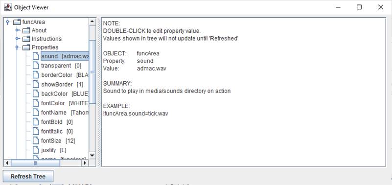
The Controls Viewer allows users to see detailed on controls. Open using F6 and expand out to find the information of interest including examples of use.

The Debug/CLI and Code Editor also provide contextual help. Please see those pages on using them for help.
|