|
General
The TextBox control is a standard GUI textbox. It allows the user to enter data into the TextBox to allow some use of the data in the interface. Note that while changing the value of the TextBox, it will change color to denote that the value is NOT locked in. This allows you to type a new value without affecting the interface using the data. Pressing Enter, tabbing off, or moving the mouse pointer off it will lock in the value where it can be accessed with [controlName] or [[this]] in its own code for setting some aspect of the interface, such as:
!plot.yMax=[[this]]
 
Both the backColor and the updatingBackColor properties may be adjusted.
Text using , { } and ; should be avoided as they are special processing characters.
Control Creation
Controls may be placed on the main or child interfaces using the Controls Palette, use F2 to open from the desired interface. When placing, it will ask for the name of the control, txt is the recommended prefix for the name, such as txtTemperature. It will also ask for the text for the control to have. Once done, click a location or draw to desired size. Like most controls, the font size will be based on the height of the control.
A control may also be created using code, such as from the file save, the Debug/CLI window, the microcontroller sending the string or other controls.
!makeTextBox Name, Left, Right (,Width, Height, Text) Parameters in () may be omitted.
If it is to be on a child interface:
!interfaceName.makeTextBox Name, Left, Right (,Width, Height, Text) Parameters in () may be omitted.
Example:
!makeTextBox txtTemperature, 20,20,10,5,300
Once placed, it may be repositioned and resized by unlocking the interface’s controls, F9, and dragging/sizing it. It may be copied or deleted by placing your mouse pointer over it and using CTRL-C and CTRL-X, and pasted using CTRL-V.
Instructions:
Instructions are used to inform the control to perform an operation. The TextBox has one special instruction beyond the standard one, clear, which will clear the text.
!txtTest.clear
See Instructions for more information on instructions.
Properties
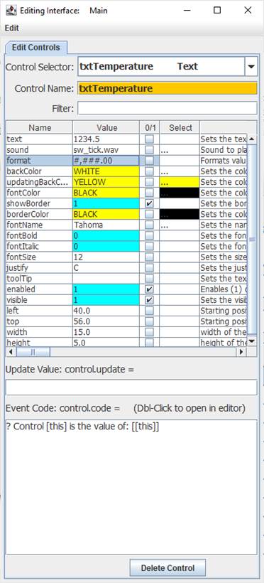
 Properties are the look, ‘feel’, and other characteristics of a control or object. They may be viewed or set using the Debug/CLI or the Interface Editor. Placing the mouse pointer over a control and pressing F3 will open the Interface Editor. Here you may view all accessible properties of the button control and modify them as desired. Please see the Interface Editor page for more information on the editor. Properties are the look, ‘feel’, and other characteristics of a control or object. They may be viewed or set using the Debug/CLI or the Interface Editor. Placing the mouse pointer over a control and pressing F3 will open the Interface Editor. Here you may view all accessible properties of the button control and modify them as desired. Please see the Interface Editor page for more information on the editor.
Properties may be set in code using:
!controlName.property=someValue
The default property, text, may be set with:
!controlName=someValue
They may be read in code using:
[controlName.property]
The default property, text, may be read with:
[controlName]
When used in its Event Code, [this] may be used in place of the controlName for reads and writes.
The TextBox has a justify property to justify left (L), right (R) or center (C).
It also has a format property to format numeric data. With a value of 1234.5:
format value of #,###.00 would show 1,234.50
Update Value
An Update Value is used to update a property of the control when new analog, digital, or message data arrives. While the Button control does not have a strong need for an update value, it is still possible to use it. For example, placing [ain0] in the update value box will update the text to read the first comma-separated value of an incoming analog string such as:
100,40,245
It will update with each subsequent string received.
Math and text may be applied to Update Values, such as:
{ ( [ain0] + [ain1] )/2 }
Event Code
When changed and the value is locked in using Enter, tabbed off, or moving the mouse elsewhere, the event code will trigger. Please see Event Code for a full discussion on event code.
The use of !this.someCommand or !this.someProperty in the event code refers to the control that is running it, as does [this.someProperty] or [this] for the control’s name and [[this]] for the control’s default value. This allows controls to have the same generic code for unique purposes and reduce coding issues such as if the name is changed.
Double-Clicking the Event Code text area will open the Code Editor where, like the Debug/CLI, it can provide contextual help and suggestions. Please see the Code Editor page for more information.
The code for a button control can be executed from other code in the interface using:
!controlName.run or !controlName.
The only named trigger event the control currently supports is <load>, which will run its code when the !runLoad instruction is issued which goes to all control or !control.run <load> is used which will trigger the specific control. Load can be used to set a certain value in the control when the interface is loaded or !runLoad issued.
Please see advanced topics on using event triggers and passing data to events.
Supported Event Triggers:
Locking in a new value, no event trigger identifier used.
<load> Runs when !runLoad is issued for all controls, such as when loading an interface.
More Information:
There exist multiple means of getting information about specific control values, properties, instructions, and events. The Control Editor shown above has abbreviated descriptions in the right-hand column. Expand the window and column to see more at once.
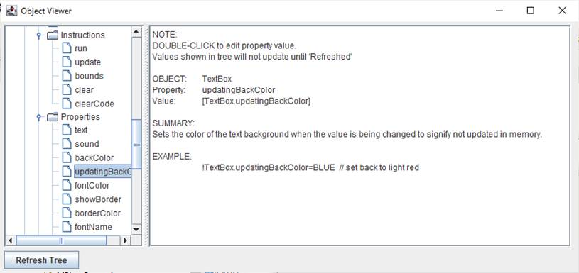
The Controls Viewer allows users to see detailed on controls. Open using F6 and expand out to find the information of interest including examples of use.

The Debug/CLI and Code Editor also provide contextual help. Please see those pages on using them for help.
|