|
General
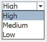
The ComboBox control is a standard GUI dropbox that allows you to enter and add items (if selected). It can be populated when created through the Controls Pallet, or with the add instruction: !controlName.add = High,Medium,Low. The value of the text selected can be returned with [controlName] or the 0-based index number of the selection [controlName.index]. It can be set through manual selection, or in code by the text value or the index value: !controlName=Low, !controlName.index=2.

When entering text via the text area when enabled (editable property), entering listed values will select that value. If the value does not exist, it will not change the properties. If enabled to add new selections (addEntered property), they will be added to the bottom of the list and selected.
Control Creation
Controls may be placed on the main or children interfaces using the Controls Palette, use F2 to open from the desired interface. When placing, it will ask for the name of the control, cbo is the recommended prefix for the name, such as cboSpeed. It will also ask for a list of comma-separated text values to populate it with, such as 'High,Medium,Low'. Once done, click a location or draw to desired size. Like most controls, the font size will be based on the height of the control.
A control may also be created using code, such as from the saved file, the Debug/CLI window, the microcontroller sending the string, or other controls.
!makeComboBox Name, Left, Right (,Width, Height) Parameters in () may be omitted.
If it is to be on a child interface:
!interfaceName.makeComboBox Name, Left, Right (,Width, Height) Parameters in () may be omitted.
Example:
!makeComboBox cboSpeed, 20,20,15,5
Once placed, it may be repositioned and resized by unlocking the interface’s controls, F9, and dragging/sizing it. It may be copied or deleted by placing your mouse pointer over it and using CTRL-C and CTRL-X, and pasted using CTRL-V.
Instructions:
Instructions are used to inform the control to perform some operation. The ComboBox has two special instructions beyond the standard ones:
clear, which will clear the items in the control.
!controlName.clear
add, which will add one or more comma-separated values to the list. The last item in the list will be selected and trigger event code for an <add> event, whether or not editable or addEntered is enabled, but if it already exists, it will not add it again and will trigger a <select> event.
!controlName.add one,two,thee
See Instructions for more information on instructions.
 Properties Properties
Properties are the look, ‘feel’, and other characteristics of a control or object. They may be viewed or set using the Debug/CLI or the Interface Editor. Placing the mouse pointer over a control and pressing F3 will open the Interface Editor (Note: When editable is enabled, this may not work and you may need to make a selection of the control first, or choose it in the Interface Editor). Here you may view all accessible properties of the control and modify them as desired. Please see the Interface Editor page for more information on the editor.
Properties may be set in code using:
!controlName.property=someValue
The default property, text, may be set with:
!controlName=someValue
They may be read in code using:
[controlName.property]
The default property, text, may be read with:
[controlName]
When used in its Event Code, [this] may be used in place of the controlName for reads and writes.
The ability to edit the text area may be enabled using editable. Entering a value which exists, that item will be selected and trigger a <select> event. If addEntered is enabled, unique values will be added and selected, triggering an <add> event.
The text value of the selection [controlName] or the zero-based index value may be returned [controlName.index].
The selection may be made with code, !controlName=text, or index value, !controlName.index=number.
Update Value
An Update Value is used to update a property of the control when new analog, digital, or message data arrives. While the control does not have a strong need for an update value, it is still possible to use it. For example, placing [str0] in the update value box will update the control to read the first comma-separated value of an incoming message string such as:
High,Low,Medium
Using .index=[ain0] would allow it update the index value based on analog value.
It will update with each subsequent string received.
Event Code
When changed, the event code will be triggered. Please see Event Code for a full discussion on event code.
The use of !this.someCommand or !this.someProperty in the event code refers to the control that is running it, as does [this.someProperty] or [this] for the control’s name and [[this]] for the control’s default value. This allows controls to have the same generic code for unique purposes and reduce coding issues such as if the name is changes.
Double-Clicking the Event Code text area will open the Code Editor where, like the Debug/CLI, it can provide contextual help and suggestions. Please see the Code Editor page for more information.
The code for a control can be executed from other code in the interface using:
!controlName.run or !controlName.
The control will trigger its normal event code when selected or added to. The <load> will run its code when the !runLoad instruction is issued which goes to all control or !control.run <load> is used which will trigger the specific control. Load can be used to set a certain value in the control when the interface is loaded, or when !runLoad is issued. It also supports <select> and <add> event triggers.
Please see advanced topics on using event triggers and passing data to events.
Supported Event Triggers:
A selecting or adding an item will trigger event code.
<load> Ran when !runLoad is issued, including on loading a saved interface.
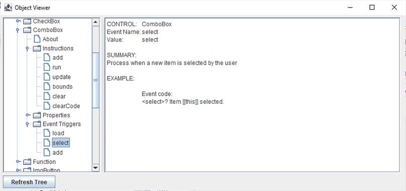
<select> An item already in the list is selected.
<add> A new item is added to the list (when addEntered is enabled)
More Information:
There exist multiple means of getting information about specific control values, properties, instructions, and events. The Control Editor shown above has abbreviated descriptions in the right-hand column. Expand the window and column to see more at once.
The Controls Viewer allows users to see detailed on controls. Open using F6 and expand out to find the information of interest including examples of use.

The Debug/CLI and Code Editor also provide contextual help. Please see those pages on using them for help.
|